
The following is a step by step set of instructions for gathering Twitter data using TAGs and then converting their outputs to a format for use with visualisation tools such as Gephi.
This is part of my using Twitter data for research series.
Step 1. Setting up TAGS for the first time
1.1. Log into both Google and Twitter
1.2. Go to the TAGS website http://tags.hawksey.info/ and select “Get TAGS (New Sheets)
1.3. Press Get TAG
1.4. Choose TAGS v6.1
This will open up a Google Sheet that you will only be able to View. Create a copy by choosing ‘make a copy’ and an identical one will be saved to your Google Drive.
1.5 Check to see if there is a menu item in the top menu list called “TAGS.”
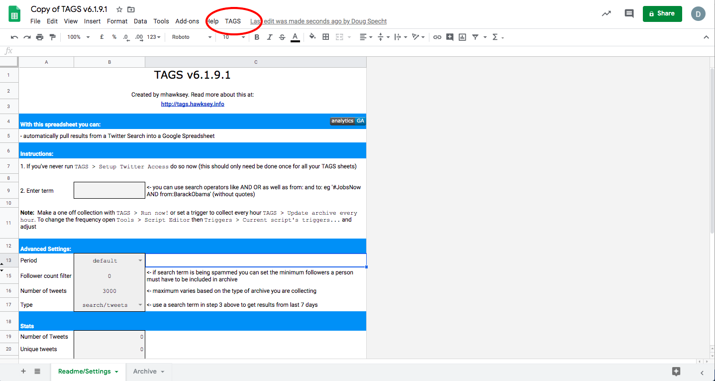
If it isn’t there, click on the “Enable custom menu” button toward the middle of the screen.
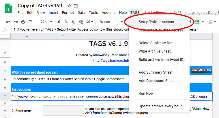
1.6 Run TAGS > Setup Twitter Access
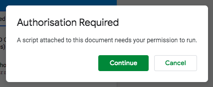
It will ask for authorization (which is you giving the script/app permission to run using your Google account).
Click “continue”
** Depending on your settings you may get a warning screen at this time that says ‘This App isn’t Verified’ – If this happens, click ‘advanced’ on the popup and then choose ‘Go to TAGS v6.1 Client (unsafe)’.
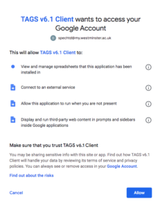
On the next screen click “allow”
Now that you have given TAGS permission to use Google, you need to give it permission via Twitter.
Choose Easy Setup of authentication.
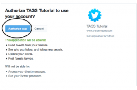
Follow the instructions until you see message ‘Success!’
Step 2. Collect tweets
2.1. Setup a hashtag
Back in your Google Sheet. In the middle of the screen, enter whatever search term or phrase you want to archive. This could be a hashtag (e.g. # SuperBowl2019), a series of hashtags, a handle, or a combination of those. This box acts as a search box within Twitter. The hashtag you enter should be one of those you have chosen to investigate for your project.
2.2. Setup basic analysis
Under the TAGS button on the menu bar, click “Add Summary Sheet” and “Add Dashboard Sheet” right away.
Two new sheets will be added in addition to the “Readme/settings” and “Archive” sheets that were already there.
2.3. Start collecting
Under the TAGS button again, click “Run Now!” and “Update archive every hour.”
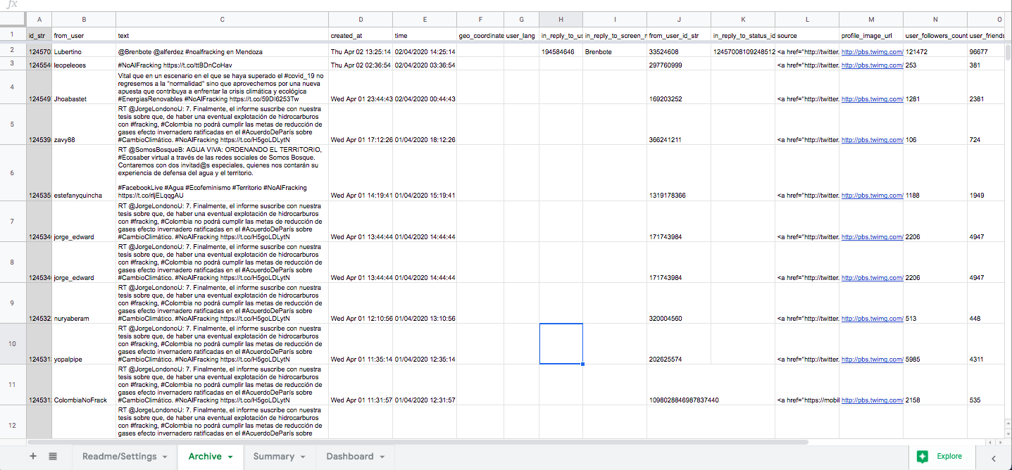
Now you have a running Twitter archive! You will notice that the Archives sheet will start to fill with results – sometimes it takes a little while for past tweets to populate the sheet. Remember that TAGS can only provide tweets from around about the past week. Download the archive as an Excel or csv file as a backup and/or to clean or play with the data.
Step 3. Analysis
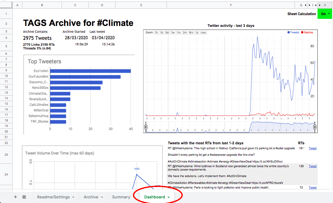
In the Dashboard sheet, set Sheet Calculation to the mode ON. You’ll see some trends information about the tweets you’ve gathered.
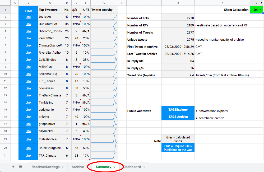
In the Summary sheet, set Sheet Calculation to the mode ON. You can see top tweeters, average number of Retweets, etc. There are also two links to additional ways of viewing the data:TAGS Archive (a searchable archive of tweets) and TAGSExplorer (a network visualization).
3.1. Publish your dataset
Before opening either of these options, you’ll need to publish your sheet to the web. First, go to “Share” in the top right corner of the screen. Click “get shareable link” and adjust settings so that “anyone with the link can view”. Then click “Done”.
In the main menu of the page under “File” select “Publish to the web” and click “Publish.” Selection option “as csv file”
3.2. Explore Achieve
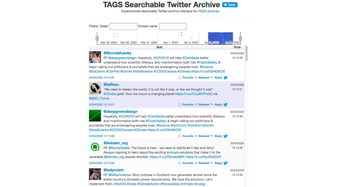
Back in the Summary sheet, if you click on TAGS Archive, you’ll be taken to a new tab with a more user friendly search functionality than the “Archives” tab of your Sheet.
3.3. Explore the network
In the Summary sheet, click on TAGSExplorer, and you’ll be taken to a new tab where a dynamic network visualization will show the participants of the archive. You can explore the top tweeters, search the archive, and click on individual nodes to learn more about what has been said.
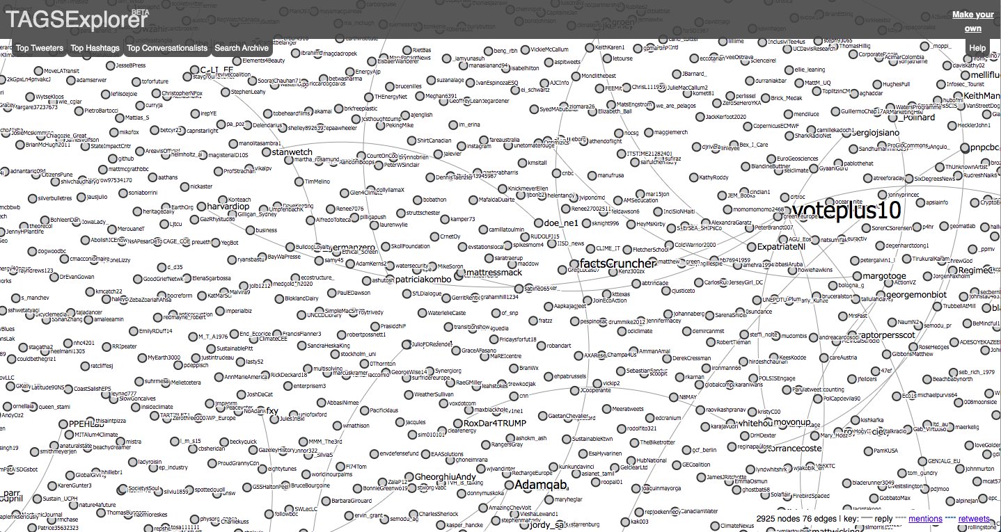
This gives us a very simple visualisation, and one that we can do some work with, but to be able to see the data better we need to enter our tweets into another kind of visualisation software.
With thanks to Aliaksandr Herasimenka for his help in putting together the instructions for TAGS
The data collected through TAGS can be searched and analysed in many different ways. However, to use it with a visualisation package like Gephi we need to clean the data and create nodes and edges for import. To do this we will need to use Python (3.5 or higher) – We are going to use Anaconda, which is a free user-friendly Python environment that comes with a host of Python packages for scientific computing and data analysis.
1. Installing the required applications
1.1. Download Anaconda for your operating system and the latest Python version, run the installer, and follow the steps. Detailed instructions on how to install Anaconda can be found in the Anaconda documentation.
We also need to add some extra databases to make this work, so…
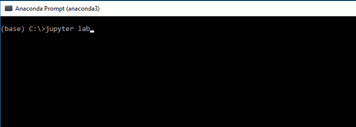
1.2. In the Anaconda prompt (or terminal in Linux or MacOS), start JupyterLab:
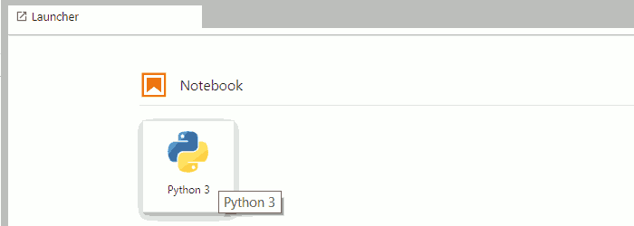
1.3. In JupyterLab, create a new (Python 3) notebook:
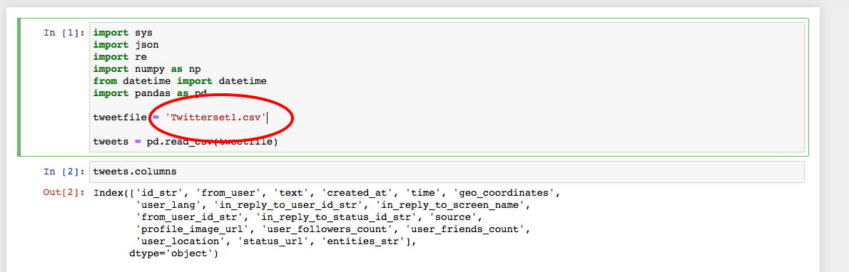
1.4. In the first cell of the notebook, you can import pandas and check the version with:
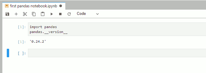
Now your pandas are ready, and we can begin to clean our data for Gephi.
2. Preparing TAGS data for processing
2.1. In your TAGS sheet (created in the previous stage) navigate to the ‘Archives’ sheet.
2.2. Choose File > Download > Comma-separated values (.csv, current sheet).
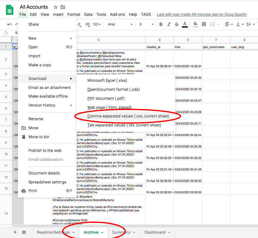
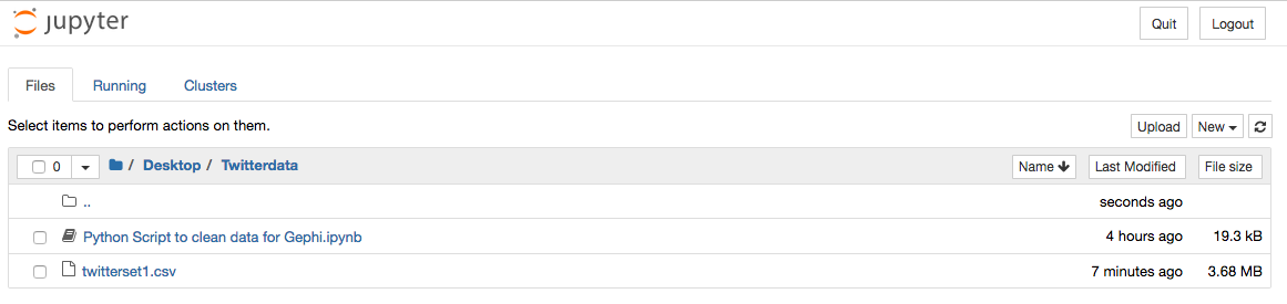
2.3. Save this file using a name without spaces, and in a new folder.
3. Running the code
The code presented below will create node and edge input tables for the social network analysis tools from the tweet datasets created in TAGSs.
3.1. You can now run one of 3 Python scripts to prepare your data for visual analysis. Use the links to download the appropriate script, and then follow the instructions below which are the same for all scripts:
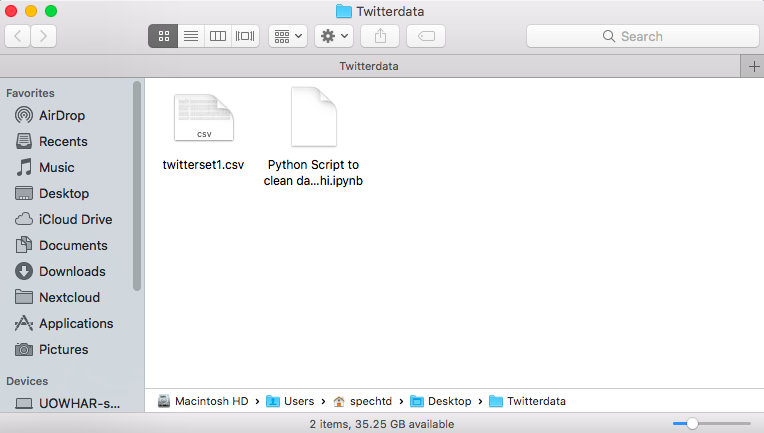
3.2. Extract the zip file into the same folder as your .csv file containing your tweets.
3.3. Open Anaconda and select ‘jupyter Notebook’
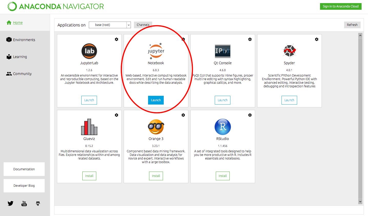
This will open in your browser window.
3.4. Navigate to the folder containing the .csv and .ipynb files
3.5. Open the ‘Python Script to Clean data for Gephi.ipynb’ file
3.6. Change the name of the file to in red to match the .csv file that contains your twitter data
3.7. Click Run at the top of the page
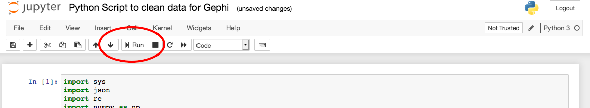
Pressing run will run each part of the script one section at a time. Keep pressing run until the scrip reaches the end and creates a new text box like below:
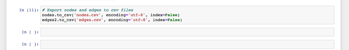
Your source folder will now contain two new .csv files ‘nodes’ and ‘edges’ – These we can import into Gephi in the next stage of the task.
We have now collected our Twitter data with TAGs and have converted it into edges and nodes. This means we can now load it into Gephi and create some visualisations of what is happening in our networks.
1. Installing Gephi
1.1. Gephi is free to use and can be downloaded from https://gephi.org/
1.2. Follow the install instructions. Support with installation can be found here: https://gephi.org/users/support/
2. Importing nodes and edges into Gephi
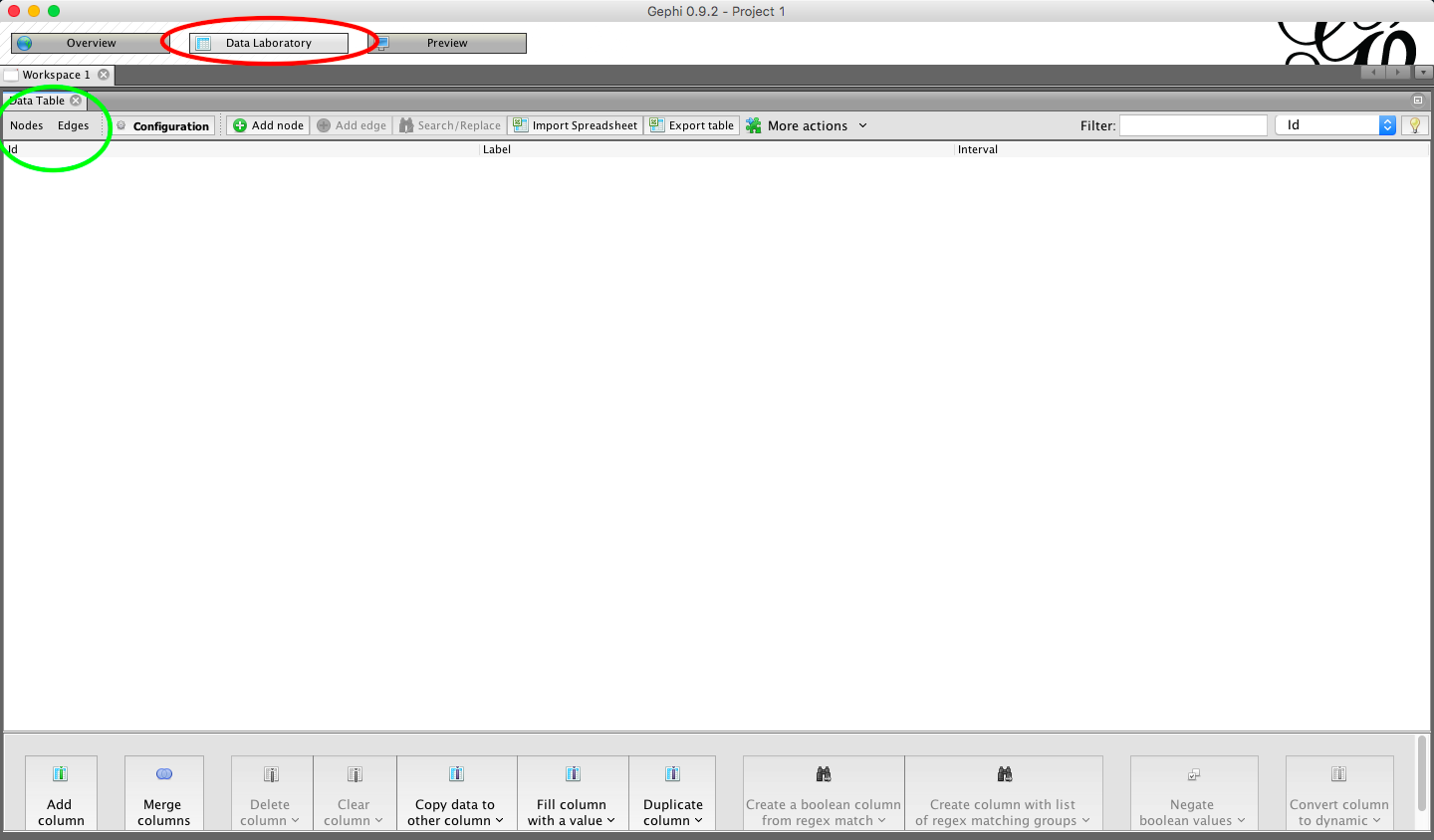
2.1. Open Gephi and choose ‘New Project’
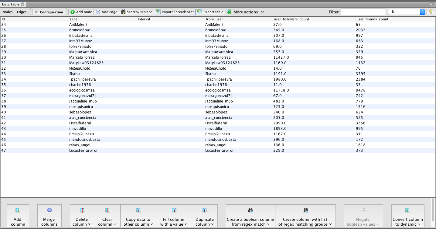
2.2. Navigate to the ‘Data Laboratory’ – Here you will see there are tabs for ‘nodes’ and ‘edges’
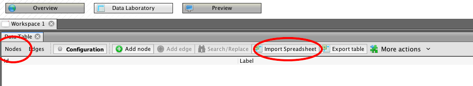
2.3. Chose ‘nodes’ and the select ‘import spreadsheet’
2.4. Fine the ‘nodes.csv’ file that we made using the python script in the previous stage.
2.5. You will be given a preview of the data you are importing – be sure to check it is importing as a ‘nodes table’
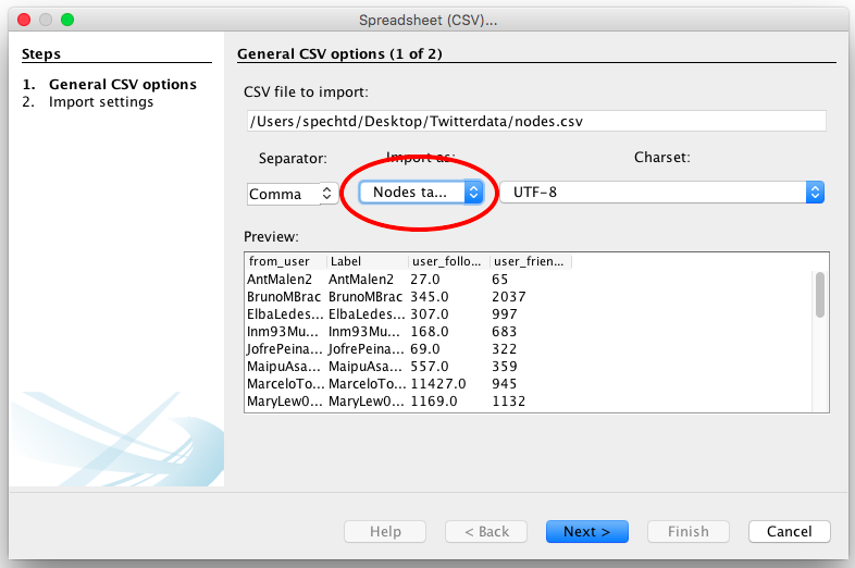
2.6. Click Next
2.7. Import settings should be automatically selected by Gephi. Click Finish
2.8. Click ok on the next popup – you will now see your node data imported.
2.9. We need to repeat the process for edge data. Select ‘Edges’ and then ‘import spreadsheet’
2.10. Ensure that import type is selected as ‘Edges’.
2.11. Click Next
2.12. Import settings should again be automatically selected by Gephi
2.13. Ensure you select ‘Append to existing workspace’ so that the edges are added to your other data.
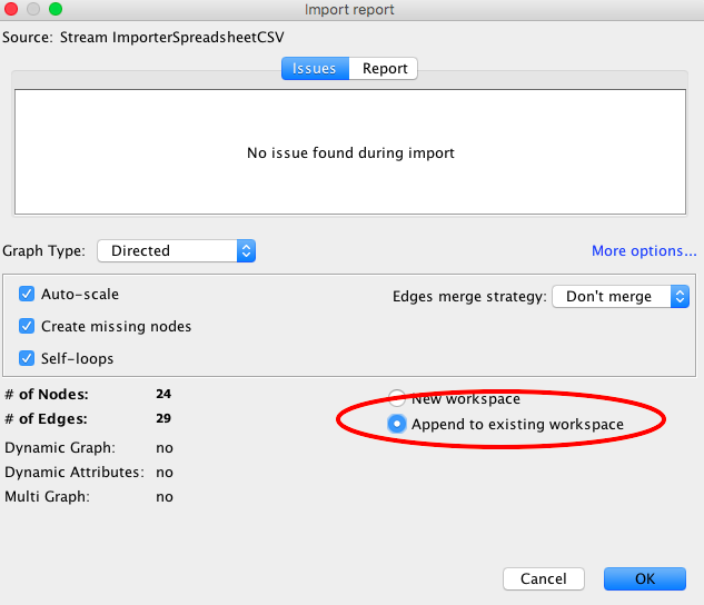
2.13. Click ok on the next popup – you will now see your edge data imported.
3. Running visualisations
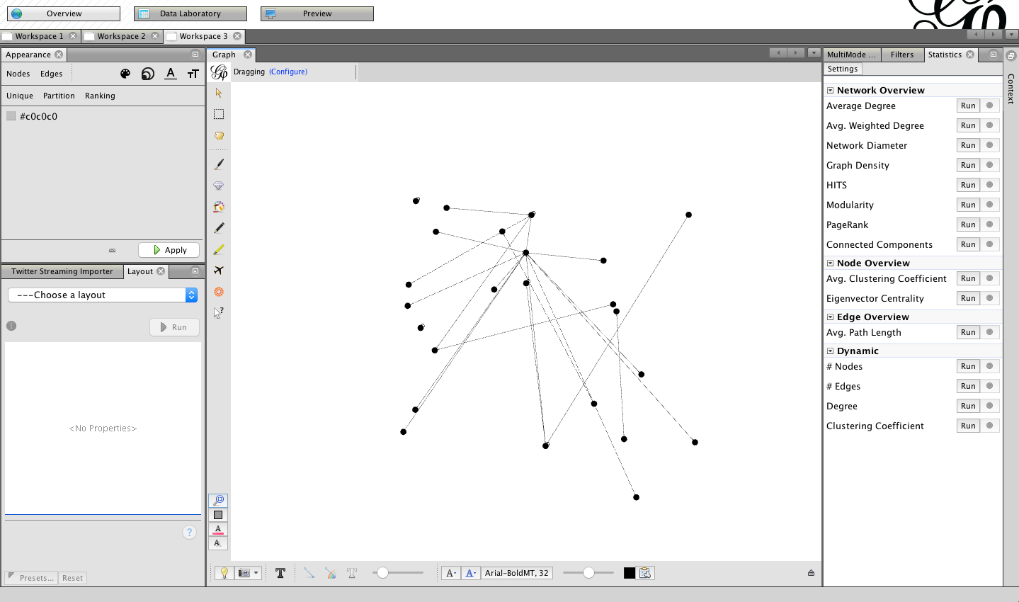
3.1. Choose ‘Overview from the top ribbon’
![]()
3.2. You will now be presented with a basic network map of the tweets you have collected.
You are now ready to process and visualise the data you have collected.
Head to my tutorial on Visualising networks using Gephi for help with that.