Once you have collected your twitter data and imported it into Gephi you will want to do some analysis to help you understand what the data means. This tutorial will show you around the Gephi interface, and point you towards some more advanced analysis techniques.
This part of the tutorial assumes you have already collected you data and imported it into Gephi. If you have not done that yet, then go back and have a look at the rest of my using Twitter data for research series.
Hopefully you have your data nice and clean and entered into Gephi. As we start the process of visualisation it is important to remember that this is a messy activity. It involves trying things out, getting thing wrong, and searching the internet for answers. This can also make it a lot of fun.
Understanding the Interface of Gephi
Gephi has three different views, all of which show you your data in different ways. Any changes you make to the data in one view will be reflected in all the other views.
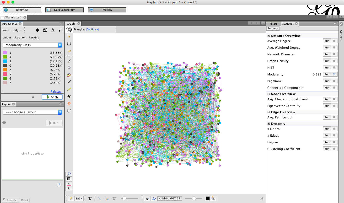
![]()
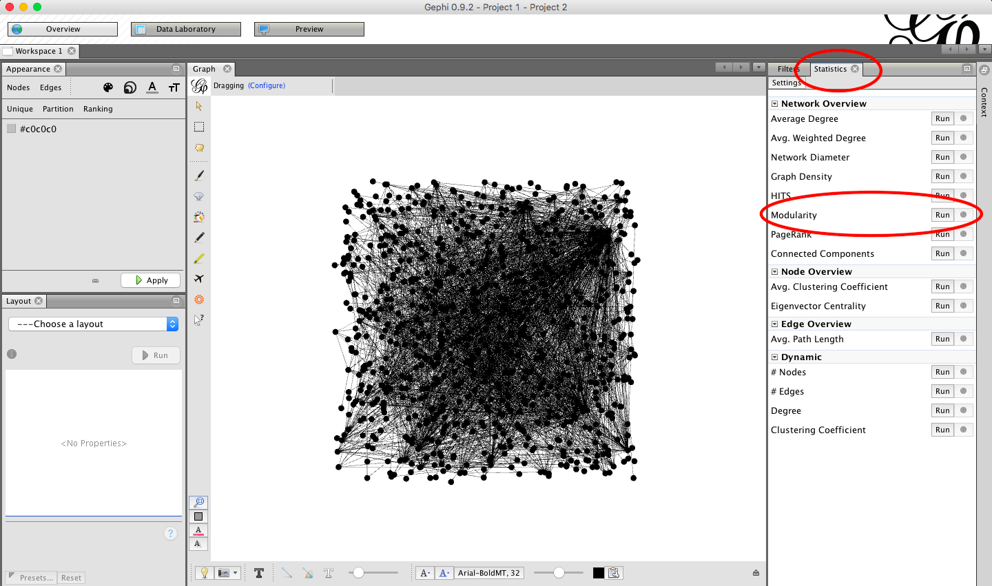
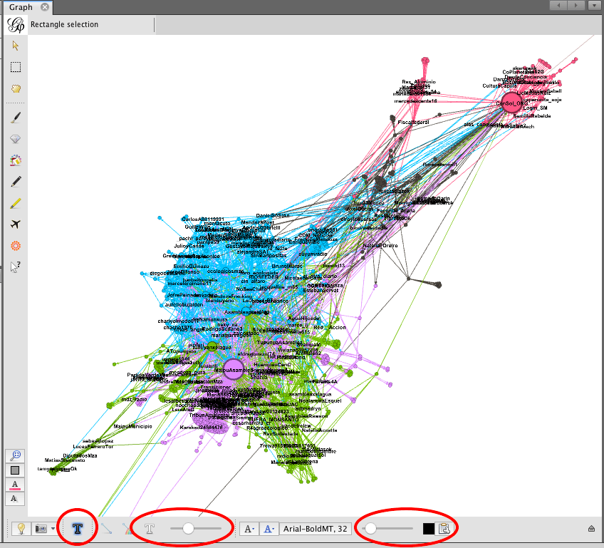
1. The Data Laboratory
You will already be familiar with the Data Laboratory, this is were you import your raw data. You can switch between nodes and edges. There are also a number of filters available to you in the Laboratory that will help you compare the raw data with the visualisations in the Overview pane.
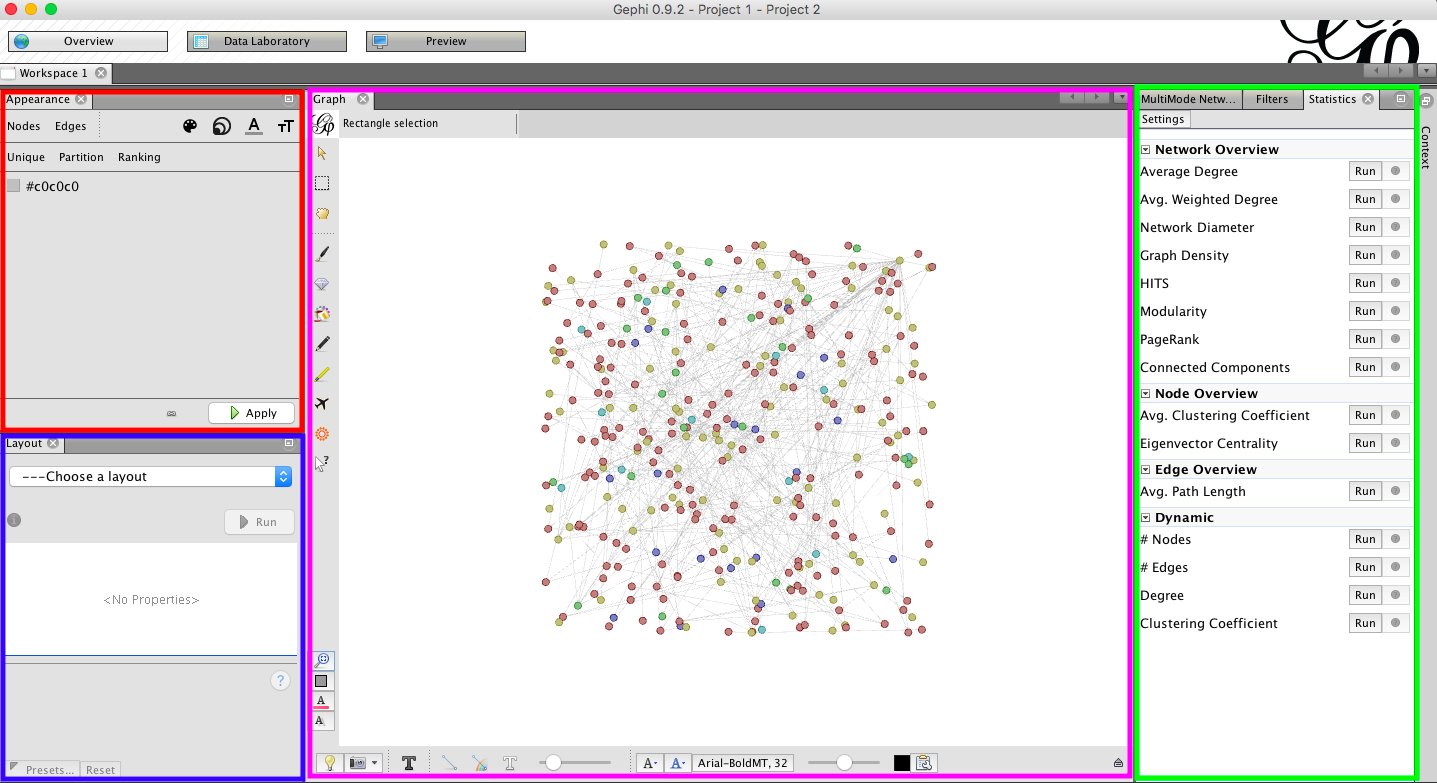
The Appearance options (outlined in Red) allows you to define the way nodes and edges look
Layout (outlined in Blue) allows to use algorithms to calculate the layout of your graph
Statistics and filters (outlined in Green) allow you to calculate various number related to your data
Graph window (outlined in Pink) shows you the raw graph data, and allow you to manipulate its appearance.
Appearance
You can change the appearance of nodes and edges. Nodes have a colour, size, label colour and label size. Edges don’t have a size.
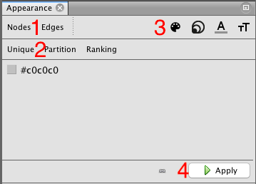
Use the Nodes and Edges buttons (1) to swap between which parts of the data you are changing the appearance of.
All options can be set as Unique, meaning that every node/edge gets the same look or by attributes including ranking and partitions (2).
You can also change the sizes of the nodes, colours, text here using the buttons at the top right (3).
Once you have set the options you want, you need to apply them to the graph by pressing “Apply” (4).
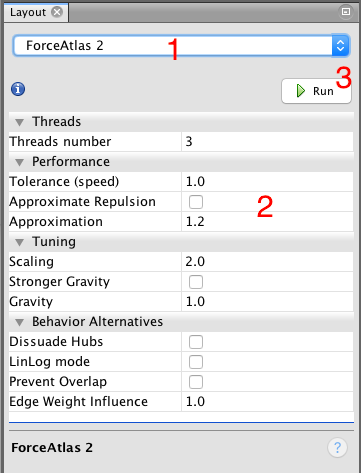
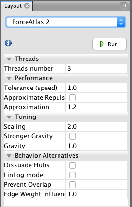
Layout
The layout area gives you access to various algorithms, you can use to calculate the layout of your graph. Each algorithm has it advantages and disadvantages. For social network graphs ForceAtlas 2 or OpenOrd is a good starting point. Some algorithm finish themselves, some need to be stopped once you like the result. Some algorithms can be
run after others and only do minimal adjustments (expansion, contraction, noverlap, label adjust) others will completely change how the graph looks like. You can click on each setting of each algorithm to get additional information of what it does.
(1) Choose an algorithm
(2) Edit the settings
(3) Press Run to start the algorithm – and Stop to stop it.
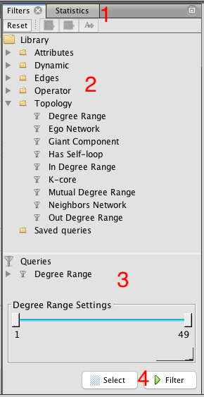 Statistic & Filters
You can choose between Filters and Statistics (1). While the statistics options aren’t self explaining, they all work the same. You click on Run and get a results page displayed. One of the most useful is Modularity, which identifies sub-communities. Once an option ran, you can always access the results page by pressing the little question mark besides the Run button.
Filters (2) are used more often in exploratory settings, because they help you look at only parts of the graph. Again there are many options to choose from, you will most likely work with Attributes and Topology. Queries can be combined. Drag the filter you want to use into the Queries space (3) and apply any settings.
To apply the filter, click Filter (4). Click Stop (same button) once you don’t want the filter anymore. While the filter is active, you will get new information in the Context area at the top left, how many nodes and edges are visible.
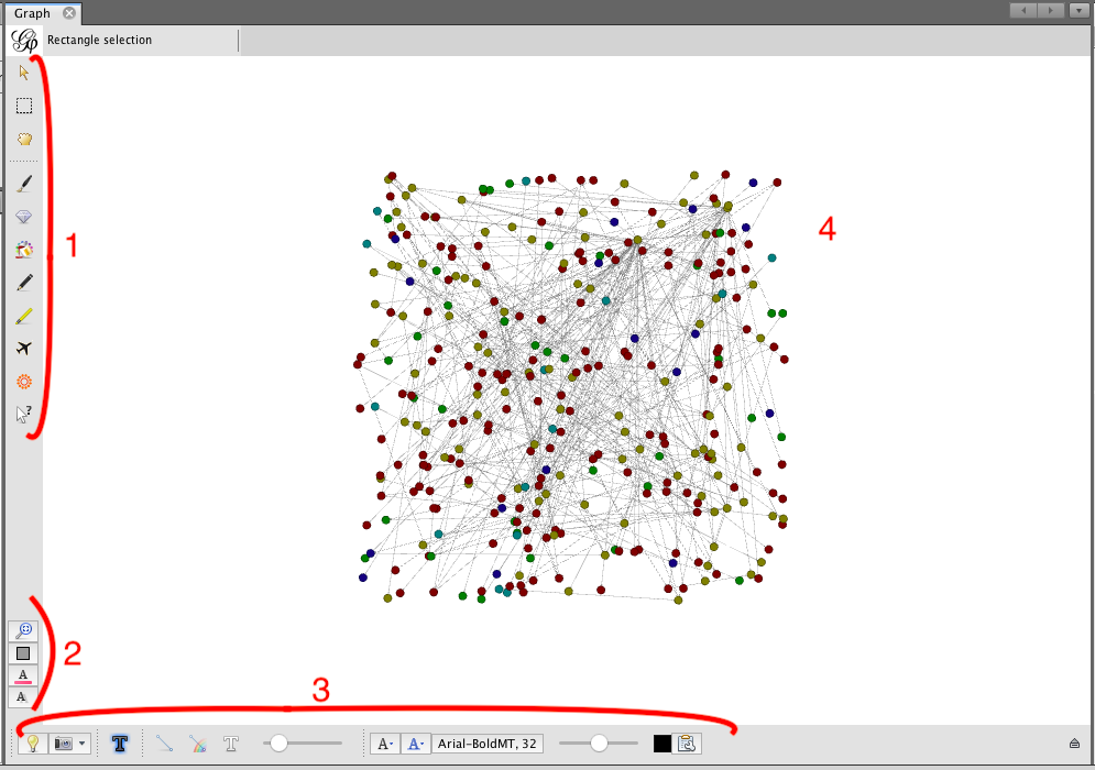
Graph
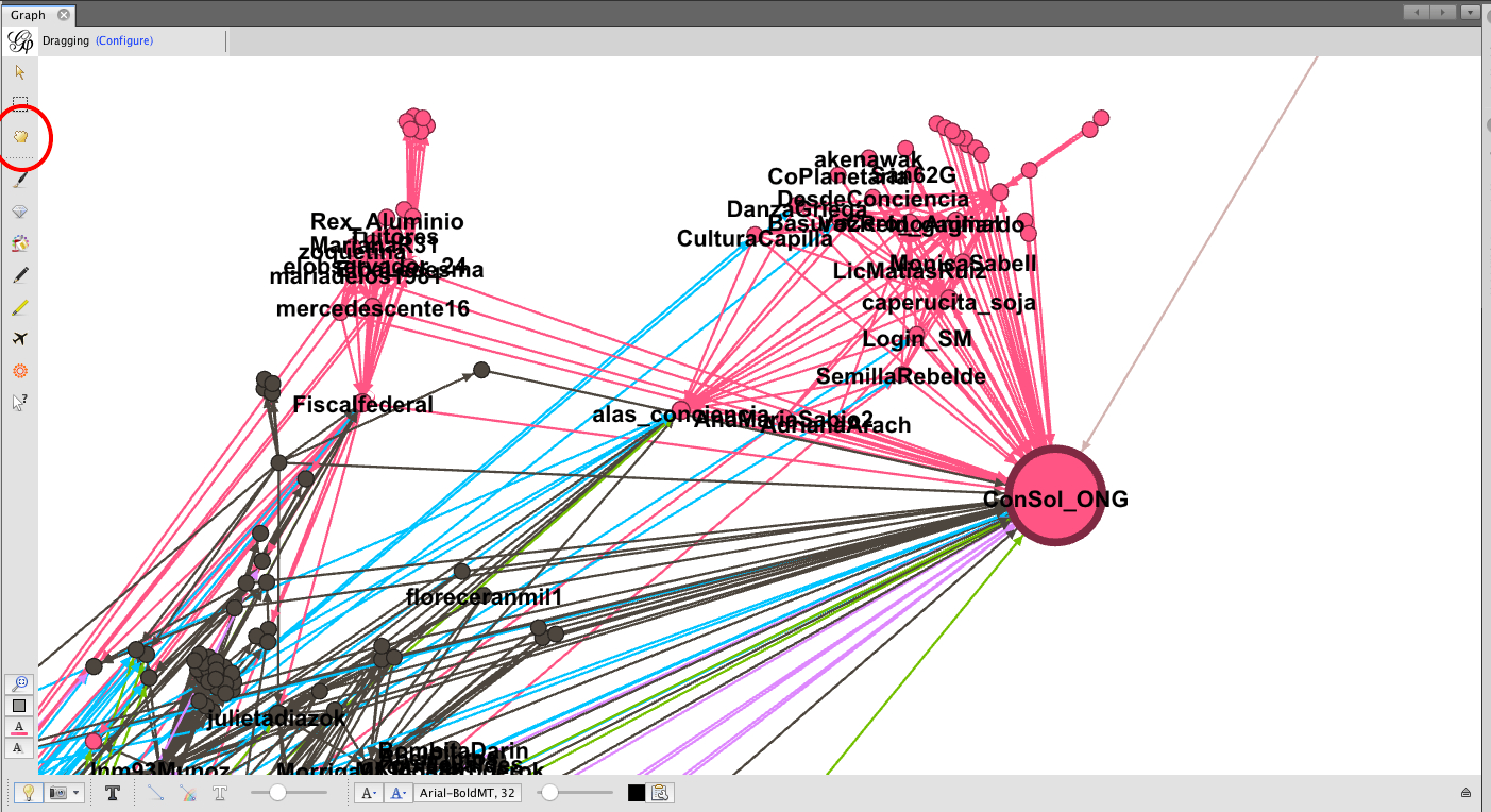
In the center of the Overview view is the Graph. You can move around by holding the right mouse button, zoom with your scroll wheel and select/drag/color/??? nodes by clicking left on them. Each of the settings on the side and bottom has a mouse over tooltip. Be careful with the settings at the bottom left. The first one, the magnifying glass is useful, when you get lost, because it centers the view on your graph. The three settings below reset colors and sizes. Irreversible. The buttons and the bottom help you to make the graph more readable or exploreable at all, if it’s to big. Turning of the display of edges helps a lot in such cases.
(1) What you mouse is doing. (2) To reset the graph. (3) To change how an what is displayed. (4) The graph.
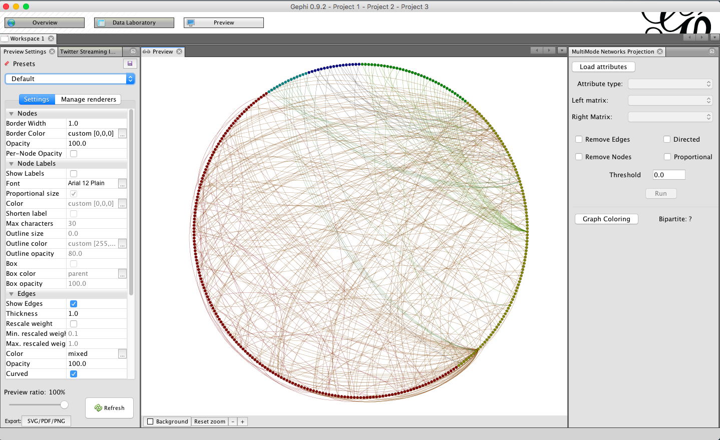
Preview
Once you are happy with your graph, you can use the Preview to render it. There are different presets and many settings to render it as you want it. At the bottom left you have the option to export it as SVG, PDF or PNG. With the Preview ratio, you can set to only render a percentage of the whole graph. This helps a lot if you need to find the right settings for a big graph which takes some minutes to hours to be render completely. In the Preview you move around by holding the left mouse button while moving. Think of it as grabbing the whole image and moving it. You can also zoom in and out. But you can choose nodes or do other things you can do in the Overview.
Running your analysis is not a set process, it will depend what you want to discover and the instructions below don’t necessarily happen in one order, but are to serve as an example of what you could do with your data. I urge you to have a play around with things and to visit some forums to see what other people have managed to do.
1. Getting Started
This tutorial assumes you already have your data loaded. If not head back to some of the other tutorials to find out how to do that. In my example I am going to use some data from a project examining communities discussing Fracking in South America on Twitter.
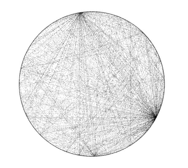
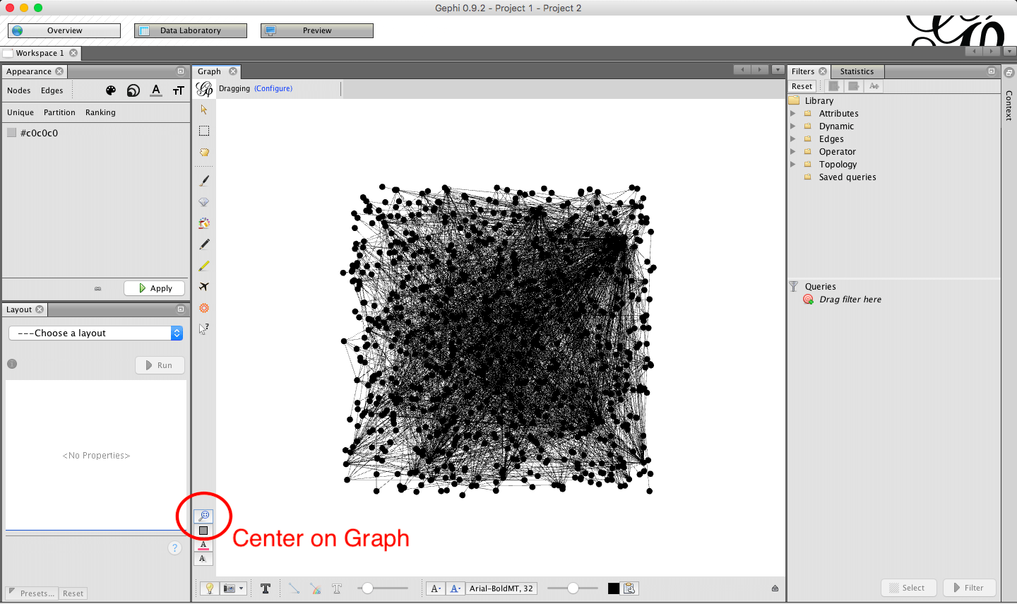
1.1. When we first load the graph we might find some of it is missing off the edge of the page. Click the center graph button to make sure you can see everything:
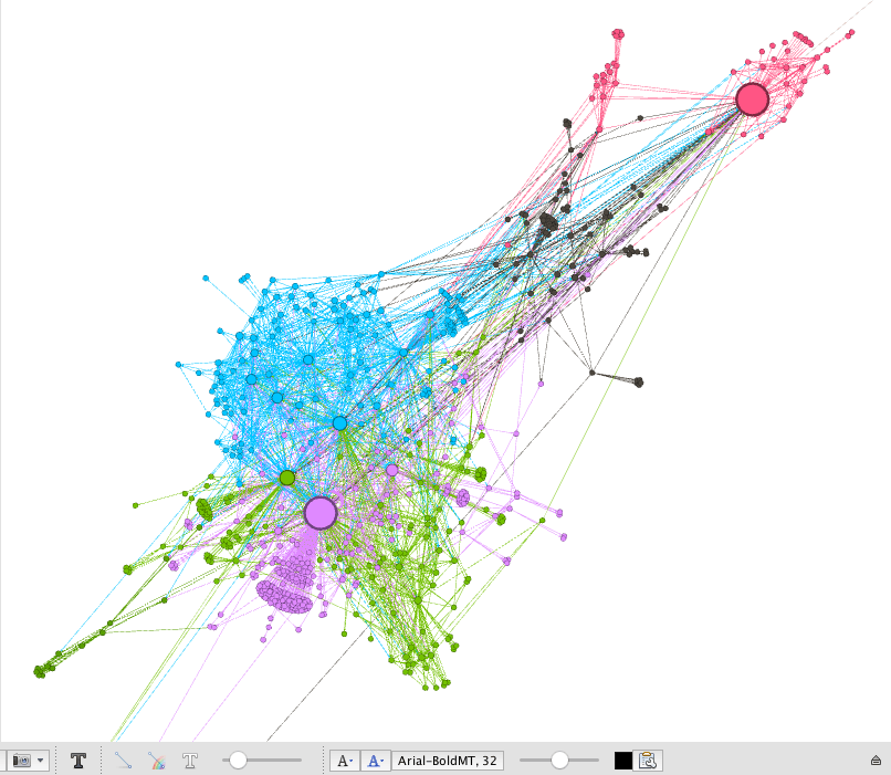
1.2. When we first load our graph it is normally in just one colour and it is hard for us to see much that is happening. In the next steps we will look for communities.
2. Find communities by calculating Modularity
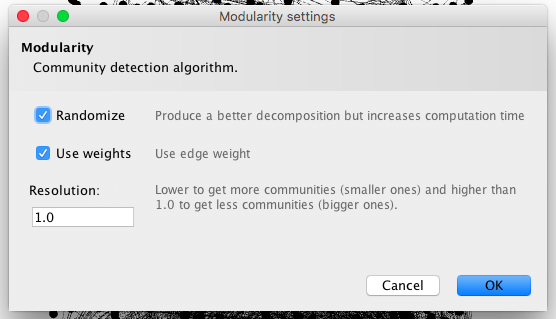
2.1. To find our communities we can run one of the statistical analysis tests. We will run the Modularity test which will give us an idea of how many communities there are in the graph. Select ‘Statistics’, the click ‘Run’ next to Modularity.
2.2. The pop up will give us a few options. You can try changing some of the options here to see how they change your graph, but for now we will leave them as the default settings.
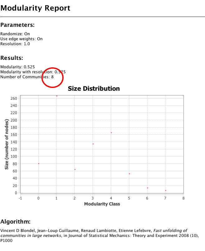
2.3. The Modularity report shows you a few things, but at the moment we are most interested in the number of communities. – Using the settings above we have identified 8 communities.
3. Colour nodes by community
3.1. We can now use the communities to colour the nodes. This will help us see the communities easily. Head to the appearance panel, select Nodes > Colour (icon) > Attribute > Modularity Class.
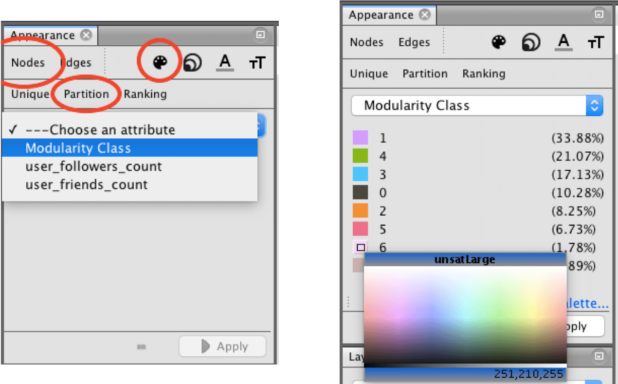
3.2. Gephi will automatically assign colours to each of the communities, if you wish to change these you can click and hold the colour to bring up a colour palette.
3.3. We can also see here the percentage sizes of each community – this might help us decide on colours.
3.4. Once you are happy with the colour choices, click ‘Run’.
We now have our nodes coloured by Community:
4. Layout using an Algorithm
To better see our ommunities we will use some layout algorithms.
4.1. In the Layout pane select the algorithm that you want to use – you might want to try a few. In this example I am going to use ForceAtlas 2.
4.2. There are lots of options on most of the algorithms, they are worth playing around with until you get something that looks right for your graph.
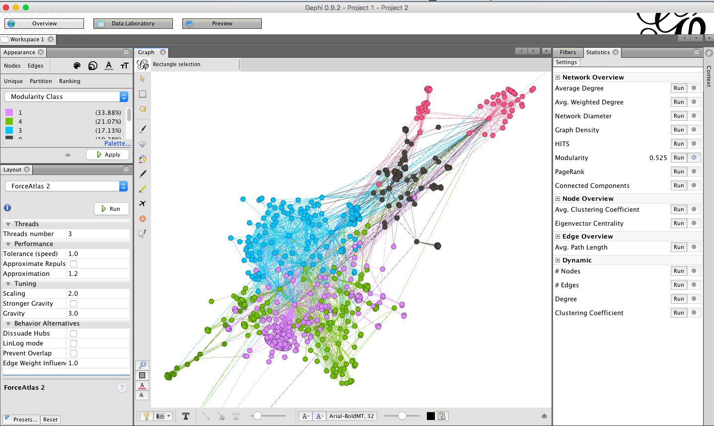
4.3. It is now clear to me the size and shape of the different communities involved in talking about Fracking online.
5. Set node size by in-degree
We might also want to know who are the most important nodes in this specific data set – Who is the most active, tweeting the most and interacting the most with others.
5.1. Go to Appearance -> Nodes -> Size -> Attribute -> In-Degree
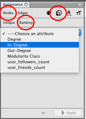
5.2. You can try setting different size ranges for the nodes to see what works best for your graph. I put my range from 5 – 50. I can now see that there are some users who are much more dominant than others.
6. Explore the Graph
Now is a good time to get a better feeling for the graph. That means a lot of zooming, scrolling, reading labels and looking up more information about the nodes – either from your original .csv file or from the data laboratory in Gephi.
6.1. Use the label buttons at the bottom of the Graph pane to turn on and off the labels for nodes and edges. You might need to adjust the size to ensure you can read them and still see the graph itself.
6.2. You can also use the grab tool to pull out individual nodes and change the shape of you graph manually.
It is very easy for me to identify the key users in my network.
7. Render it
When you have finished creating your graph we can export it.
7.1. Go to the Preview window in Gephi
7.2. Click Refresh – You will see you graph looking smoother and more ‘finished’
7.3. Play around with the settings in the ‘preview settings’ pane.
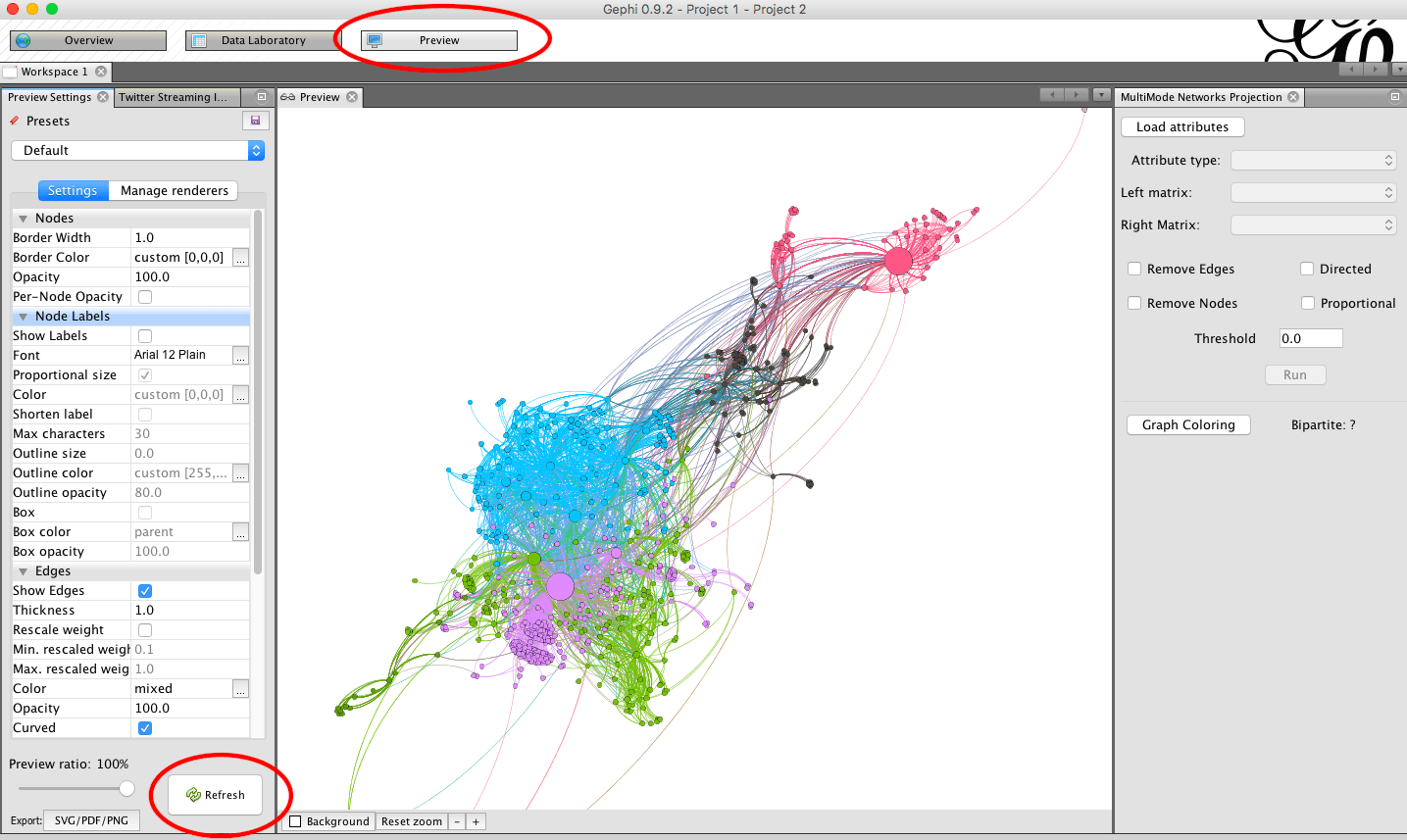
7.4. Once you are happy with everything, hit export in the bottom left corner and save a picture of your graph.
There are a lot of advanced options with Gephi, most of them just take a bit of time to play around with in order to create something really interesting or useful for your project. The good thing is, because Gephi is free and open source, there are lots of people out there making plugins and tutorials, and there is a great community of developers. Take a look at some of the links below to enhance your Gephi outputs.
Plugins
We already used a plugin in the tutorial on getting Tweets directly through Gephi. However, there are loads more available. Some help with visualisations, others with inputting or sorting data, and there are a wealth of other options available too.
The official Gephi plugin page can be found here: https://gephi.org/plugins/#/
Github also hosts a wide range of additional tools and plugins for Gephi: https://github.com/gephi
Showing data over time
One of the more interesting features of Gephi is being able to map over time. Some temporal features are built in, and there are also plugins to help make this really work well.
For some reading on the subject try Chapter 9 from Visualising Graph Data. Available free here: https://livebook.manning.com/book/visualizing-graph-data/chapter-9/
Community
The Gephi community is a friendly one, and sometimes when you have exhausted all options it can be worth reaching out to others for some help.
Gephi Facebook Group: https://www.facebook.com/groups/gephi/
Gephi Forum: http://forum-gephi.org/
Gephi Wiki: https://github.com/gephi/gephi/wiki
You could even join the Data Visualization Society: https://www.datavisualizationsociety.com/
Happy Graphing!